This report will focus mostly on color and style. I'll cover:

Red and green: what a wonderful color pairing. Surround a dab of vivid red with a sea of dull greens and that red will sing. The same goes for orange and blue or yellow and purple.
Why are these color pairings so effective? It all comes down to contrast. Red and green, orange and blue, yellow and purple: these are complementary colors. They oppose each other on the color wheel and have a striking contrast when paired. They also contrast in temperature, with red being warm compared to green, orange being warm compared to blue, and yellow being warm compared to purple. So there's an inherent contrast in both hue (red against green) and temperature (warm against cool). You could also incorporate value contrast by making one color darker or lighter than the other.
Of course, these color pairings are not mistake-proof. You will need to orchestrate the right balance between the two colors and they will need to make sense in your painting. Typically, you will make one color dominant over the other. If your main colors are red and green, perhaps you will make the red striking and brilliant and the green restrained and muted. You should also consider how prominent each color is in terms of space. A small dab of vivid red will balance nicely against a large area of dull green. A large area of vivid red might overpower the painting.
My recent painting, Brisbane City, Mist, is built around the color pairings of red and green and orange and blue. It was a strange day in Brisbane city. Mist enveloped the city and everything was bathed in soft, white light. The grass was wet with dew and glimmered in the light. The greens were rich and bright and the ground was scattered with flowers that had recently fallen and still retained their fiery colors.

In this painting, the reds and oranges are dominant over the greens and blues. They are the richest and most saturated colors. The greens and blues play more of a complementary role. However, it isn't clear-cut. The greens and blues are far from dull and take up much of the space in the painting. They compete with the reds and oranges for our attention. But, once our gaze settles on the painting, it is the reds and oranges that our eyes gravitate towards.
Another strategy for this painting would have been to further restrain the greens and blues to allow the reds and oranges to command even more attention. That's what Claude Monet did in Poppy Field Near Vétheuil. Notice how the greens and blues are weak in terms of saturation. They stand back and allow the reds to really sing. This is the safer approach when dealing with complementary colors. My painting is teetering on being overdone in terms of color.

I believe the late Richard Schmid used this phrase in one of his workshops: painting comes down to putting the right color in the right spot. Of course, this is an extreme simplification, but it's true. The challenge is working out what is the right color and what is the right spot.
To mix the right color:
- First, observe what color you need to mix. Be objective and careful of optical illusions (your eyes will sometimes play tricks on you).
- Mix that color. Focus on getting the right value, saturation, and hue (or temperature).
Color Mixing Guidelines
If your color is too light, consider adding black, brown, gray, or any color that is darker.
If your color is too dark, consider adding white, yellow, or any color that is lighter.
If your color is too weak, consider adding a stronger color. Keep in mind, it is easier to make a color weaker than it is to make it stronger.
If your color is too strong, consider adding white, black, gray, or the nearest complementary color.
If your color is too warm, consider adding white, gray, or a cool color.
If your color is too cool, consider adding a warm color.
- When you are confident in your color, place a small test dab on the canvas. Assess if the color is true and accurate. If so, commit. If not, make further adjustments and repeat this step.
That's what color mixing comes down to. I'll give you an example of what my color mixing looked like in my Brisbane City, Mist painting:
- I needed to mix a color for the bright orange and red flowers.
- I clearly observe the reference photo and draw on my memory of the subject, particularly my first impressions. The colors are rich and saturated with tiny dark and light accents. From memory, these colors were striking amongst the greens and commanded attention. In shadow, the colors retained their strength but were darker and cooler in temperature.
- I start with a base mixture of cadmium orange.
- From there, I need to make the color lighter, so I add a touch of titanium white. Then I need to make the color a bit warmer without changing the value too much, so I add a touch of cadmium yellow. The color seems a bit light, so I add a touch of alizarin crimson to darken it whilst retaining the warmth and strength.
- I grab a small amount of the mixture on my brush and place a small dab on the canvas.
- I observe the relationships between my color and the surrounding colors. It looks fine, so I proceed to add more color and give the flower some shape and form.
Placing the color in the right spot will require your skills in drawing and brushwork. You must be able to take the color you have mixed and place it correctly on the canvas and weave it in with the surrounding colors so that it looks like part of the whole. It doesn't matter how accurate your color mixing is if you cannot place it correctly on the canvas.
It is also assumed that the surrounding colors are true and in the right spots. If the surrounding colors are wrong, then this new color will likely appear wrong as well. That's why color is such a tricky area to master in painting. Not only must you mix the right color and place it in the right spot, but the surrounding colors must also be right. This is why it's important to always consider the relationships between the colors. Is my color mixing light enough, rich enough, and warm enough in relation to the surrounding colors?
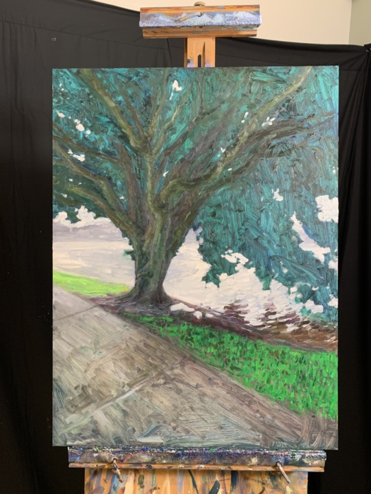
I completed two paintings in June 2022: Brisbane City, Mist which you have already seen and Brisbane City, White Light. The first follows a more impressionist style, with dynamic brushwork, exaggerated color, and simplified detail. The latter follows a more realistic style, with fine rendering, restrained colors, and careful detailing.
It can be a valuable exercise to vary your style like this. Below are some of the lessons I learned from doing so:
- Changing style requires a change in mindset. Painting in an impressionist style requires a focus on color, relationships, and pushing ideas. I typically paint fast and with instinct. Painting in a more realistic style requires careful attention to detail. It's slower and more calculated.
- Certain styles develop certain habits that are near impossible to change. For example, because I typically paint in an impressionist style, I have developed a preference for dabbing, broken strokes and simplified detail. I could feel an uncomfortable pull in this direction during the second painting.
- Painting in an impressionist style tends to be more forgiving of mistakes in drawing and detail. However, there is also the challenge of making the painting work as a whole without it coming across as reckless and sloppy.
- Trying a different style might help you break out of a mold and it may teach you something new that complements you broadly as an artist.
- There may be a reason you lean towards a particular style. I get easily bored and impatient, so the impressionist style suits me. I don't ever see myself spending 50+ hours on a painting with a tiny liner brush capturing every single detail. Before trying to change your style, consider if there's an inherent reason why you paint the way you paint.
Note: If you are new to painting, don't worry yet about style. It will develop naturally over time, no need to force it. This section is more for people who have been painting in a particular style for several years and could benefit from branching out from time to time.
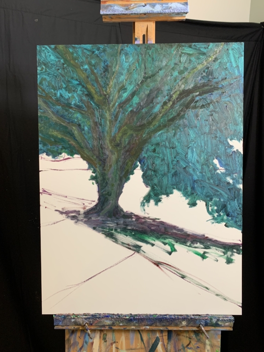
For this painting, I started with a wash of ultramarine blue to act as the foundation for the shadows. I then painted the negative space using thick, broken color and subtle mixing with the blue on the canvas. Finally, I rendered the shadows and added the bright orange and red flowers.
You can download the reference photo here.
I adopted a more careful and calculated approach for this painting. I started with a fairly detailed sketch and worked from part to part. This approach was much slower but also less prone to mistakes.
You can download the reference photo here.
I appreciate you taking the time to read this report. If you ever need anything, let us know at admin@drawpaintacademy.com.
Happy painting!

Dan Scott


Great article! The color mixing info is very much appreciated. I love both paintings, but the impressionistic style really pops for me! It is just gorgeous. Also, providing the progress shots is very helpful. I take photos after each painting session so I can review and plan next moves; but also helps to see afterward where I can improve for future paintings.
Thank you for this instructive article. My paints are all of realistic style and I’m now trying to render some Impressionistic style paints, but it’s not easy. Therefore After painting the Brisbane city mist ( I sent you a copy) I’ve started to paint it again copying your impressionist style.
Wonderful article Dan!! I love experimenting with colors in my paintings. I am more of a realist landscape painter and love working with compositions containing lots of color. . . .
Thank you, Dan. This is very helpful for a sort of “realist” painter such as myself. I am always so attracted to impressionism but both of your paintings here are exceptions. Such amazing trees in your part of the country.