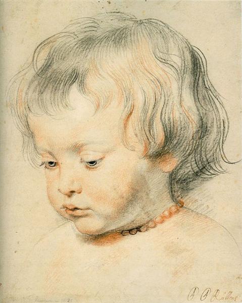
This month’s featured artwork is Portrait of Son by Peter Rubens. I love this drawing. I plan to do a similar one of my daughter, Elora (I need to hurry up as she is growing fast).

Brief Details About the Painting:
- Chalk on paper.
- 25 x 20 cm (9.8 in x 7.8 inches).
- Completed c.1619.
- Location: Unknown.
Your Thoughts?
Use this as an opportunity to test your ability to analyze master paintings. In the comments below, share what you think are the top 3 most important aspects of the painting. These could relate to areas such as composition, color, value, progress, brushwork, subject, or symbolism. Once you have done that, you can compare your thoughts with my own in the drop-down below.
Click here to see my thoughts.
- Rubens did a masterful job capturing the child’s youth and features.
- Subtle contour lines reiterate the major forms (look at the child’s cheek). Rubins also used contour lines for shading. The denser the overlapping contour lines, the darker the shadow.
- Notice the use of curves and the lack of straight lines. Curves inject life and fluidity into the subject.
- The tan-colored pencil softens the drawing and plays well into the idea of skin tones.
- The highlights are soft and only a touch lighter than the surrounding mid-tones.
- Within the shadows, some areas are lighter than others. The lightest parts are the reflected lights. The darkest parts are the core and cast shadows. It always pays to understand the basics of light and shadow. So much of drawing and painting comes down to being able to render the effects of light and shadow on simple forms. In this case, think of the cheek as a sphere with light coming down from the top left. See this post for more details on the basics of light and shadow.

- There is a dark accent around the child’s neck. This provides a point of contrast for the rest of the drawing. It makes all the other colors appear light by comparison.
- The drawing tapers off towards the bottom. It does not come to an abrupt end. This is an appealing way to finish studies and sketches.

I like the hard and soft edges in the drawing. Also, economy of lines. His use of color and shading to define features is masterful. I’ve tried drawing and painting children, it’s hard to get likeness.
I agree that it’s hard to get it just right when it’s known person. I recently did a painting of my granddaughter with her horse for her 20th birthday. I was happy with it except I had difficulty with her face and expression.
As is true with most viewers of art, I am drawn to eyes first. In this sketch, I find them pleasantly and ever so subtly rendered in blue which contrasts nicely with the tan pencil
I am reminded that contrasts on a face are gradual and subtle usually, especially with youth. He focuses on what I like most about babies their eyes, lips and cheeks. Each is an element of focus via detail or color. Just precious rendering.
The economy of lines is amazing, as is the sparse touches of a subtle color. The result is a soft and gentle rendering of how we view a beloved child. In addition, the way he rendered the child’s expression truly suggests the innocence of children.
Rendering is very good. I think the composition is weak. the linear emphasis of the eyes leads to the hair, the curves of which leads outside the frame. Had the head been positioned farther to the right and up a little higher in a new frame, leaving an eye focus space in the lower left might be better
The wispy hair adding movement. The sanguine pencil adding warmth, and the eyes looking downwards add a mystery/storyline as to what the little girl is thinking.
oops, I see it is title son, i thought it was a little girl with the necklace!
I love the detail yet simplicity of the portrait. The curvy lines for the hair are just enough, highlights and shadows are spot on for the face and neck. Less is more in this artwork.
What strikes me is the impression of light through the poetic use of a few contour lines to map form including that of the wisps of hair. These work with the equally restrained passages of shading to suggest planes and shapes. Lovely.
I think the composition is OK. Children have large heads. The little boy has a natural, unposed look. I noticed the soft rounded cheeks and high forehead. The pink tone throughout is excellent.
Love this painting so perfectly done his hair is so detailed