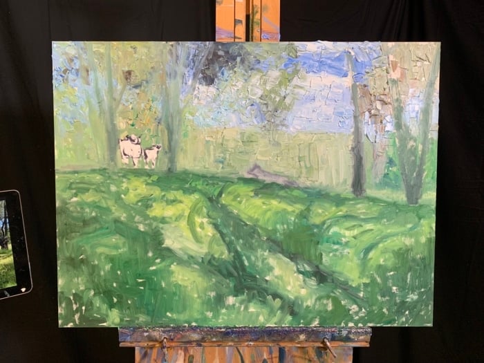
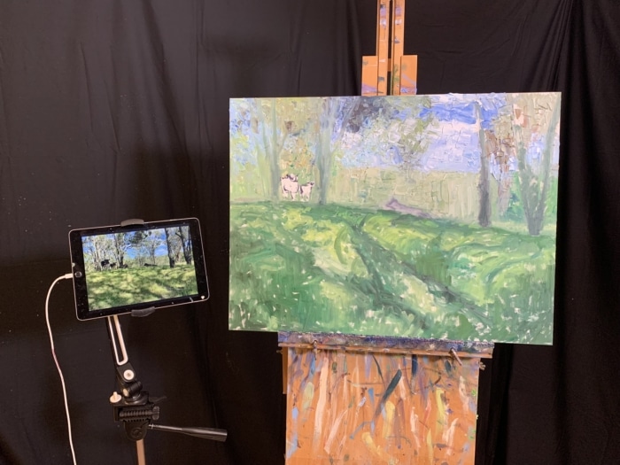
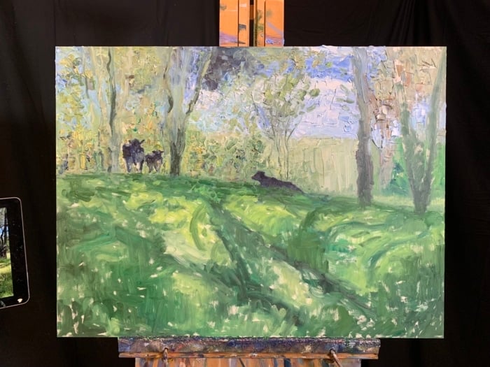
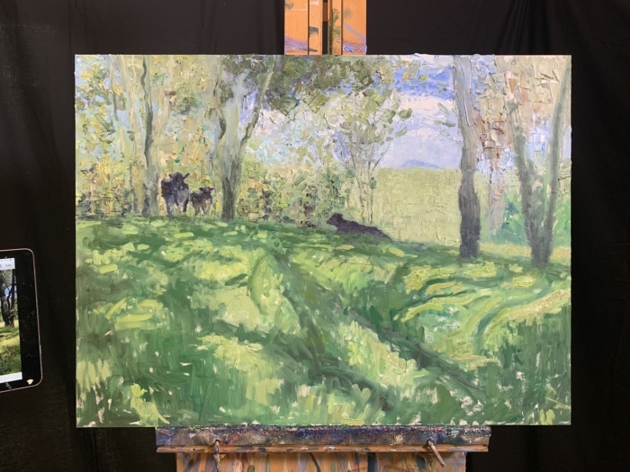
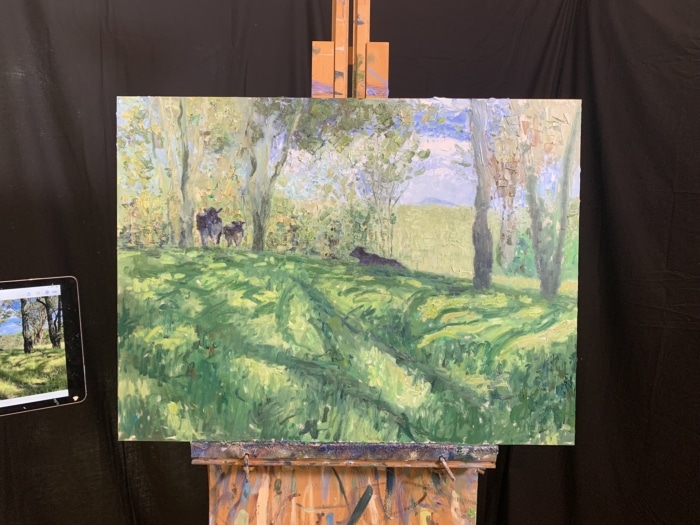
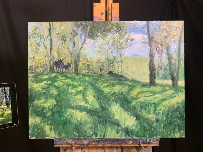
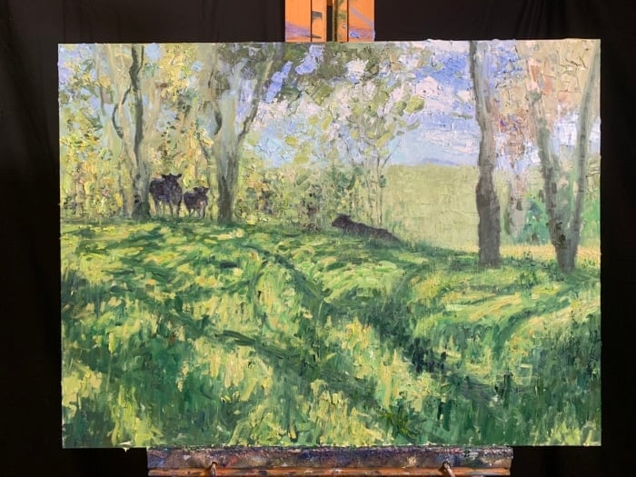
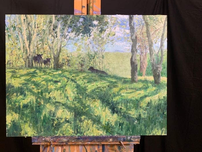
This month's report is based on my recent painting, Maryvale, Cows (see below). I painted from this photo taken last year at Maryvale, Queensland. It was Chontele’s 30th and we stayed in this beautiful cabin in the hinterlands. As we were leaving for home, I remember asking Chontele to stop the car so I could take some reference photos. When inspiration strikes, you must be willing to take action!
I'll cover:
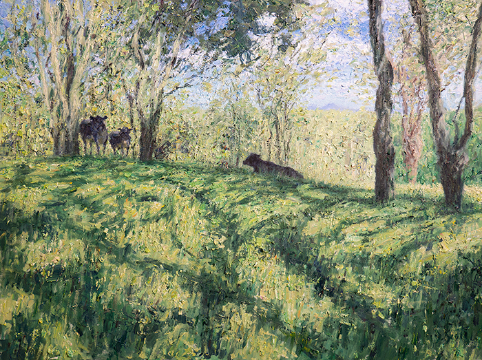
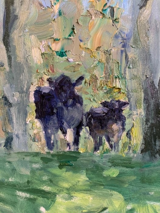
A tricky aspect of this painting was making the cows appear distinct yet part of the surrounding landscape. If I made them too distinct, they would appear out of place. If I made them "fit in" too much with the surroundings, they might be hard to identify as cows. My solution involved edges, colors, and detail.
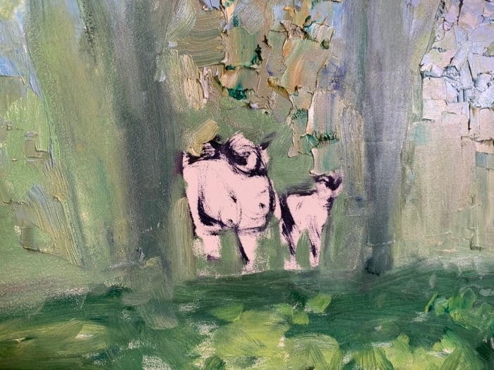
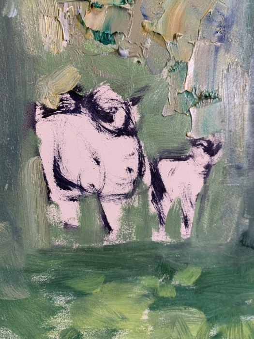
Edges: If you look closely, you’ll see the outlines of the cows are a mix of soft (or broken) and hard edges. The soft edges allow our eyes to transition between the cows and the landscape. They are most evident around the legs of the pair on the left (see below). Notice how the edges are rough and broken and how the surrounding landscape colors push in and overlap. Also notice how the bottom of their legs melts into the landscape. There are no hard and distinct edges here.
The hard edges give the cows clarity and focus. I was selective in my use of hard edges, using them only to outline key features or characteristics. You can see them around the ears, the tops of their heads, and parts of their backs and shoulders. Had I overdone it with the hard edges, the cows would appear too distinct and out of place. They wouldn't look like part of the landscape.
It's also important to note that the reference photo is not that helpful in determining which edges to make hard and which edges to make soft. Cameras tend to capture the world in much more detail and clarity than we need as painters. If I had blindly copied the reference photo, I would end up painting the cows with too many hard edges. It's up to me and my artistic judgment to determine which edges to soften.
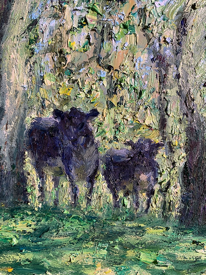
Colors: I made sure to have subtle links between the colors I used for the cows and the surrounding landscape. For their bellies, I used dull yellow (a mixture of cadmium yellow, dark gray, and a touch of viridian green) to suggest reflected light coming up from the grass. For their black hides, I used similar colors to the darks of the trees. Also, instead of using pure black from a tube, I mixed my own black using ultramarine blue plus cadmium orange. This black is not as rich and deep as black from a tube, making it easier to fit in with the surrounding colors.
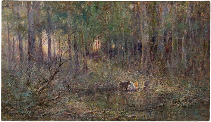
Detail: I used only enough detail to make sense of the cows and no more. They are a key focus of the painting, but I don't want to smack you over the head with them. Rather, I want your attention to be gently pulled in their direction. I drew inspiration from Frederick McCubbin's Violet and Gold, which is this month's featured painting.
The key takeaway here is that all the parts must work together as a whole. You want to create a beautiful painting, not an arrangement of beautiful parts.
This painting is a great demonstration of different techniques working together in harmony. I did anything necessary to get the desired marks on the surface. Scratching, flicking, dabbing, poking, scumbling... Below are some of the techniques I used in detail.
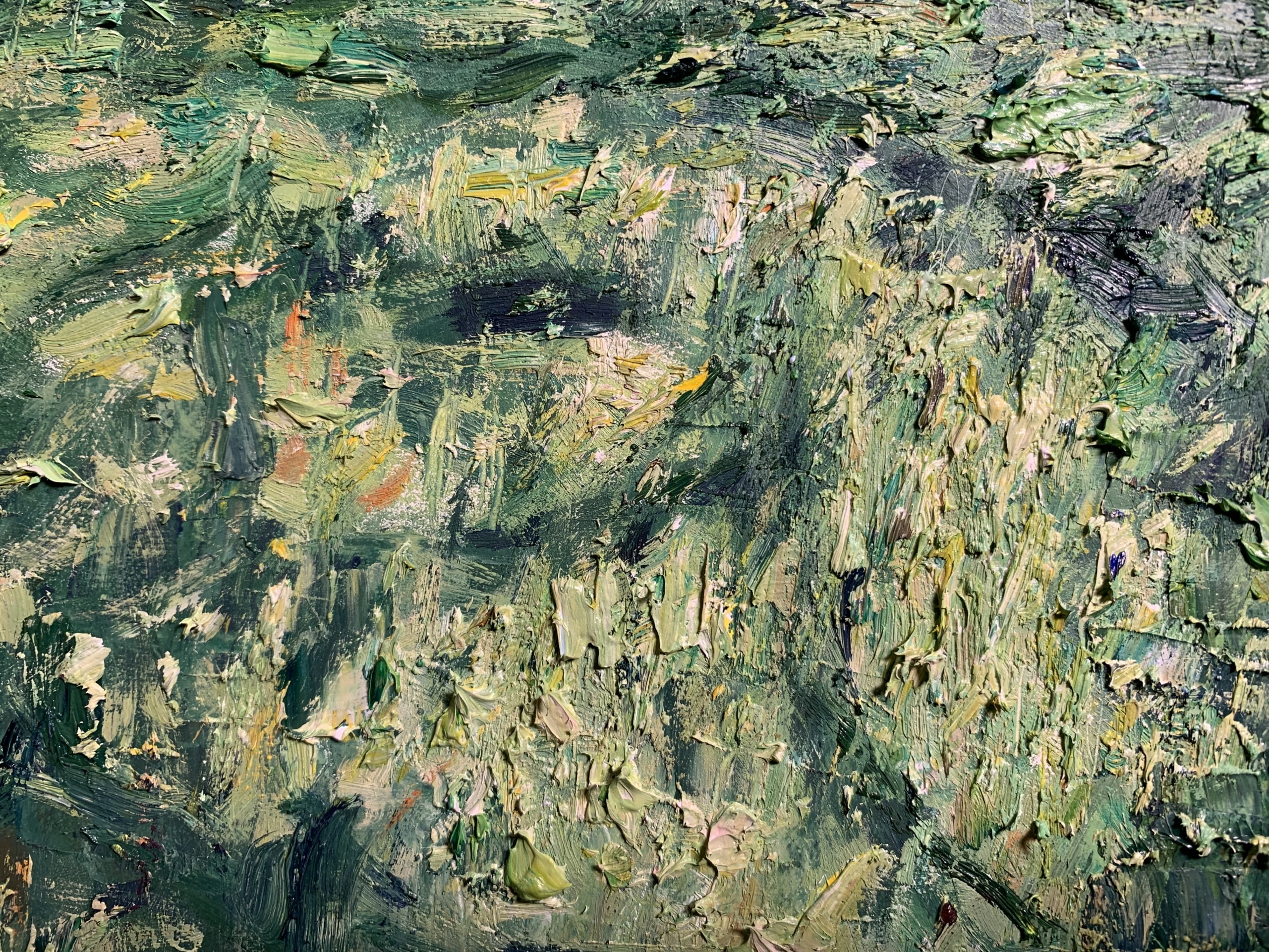
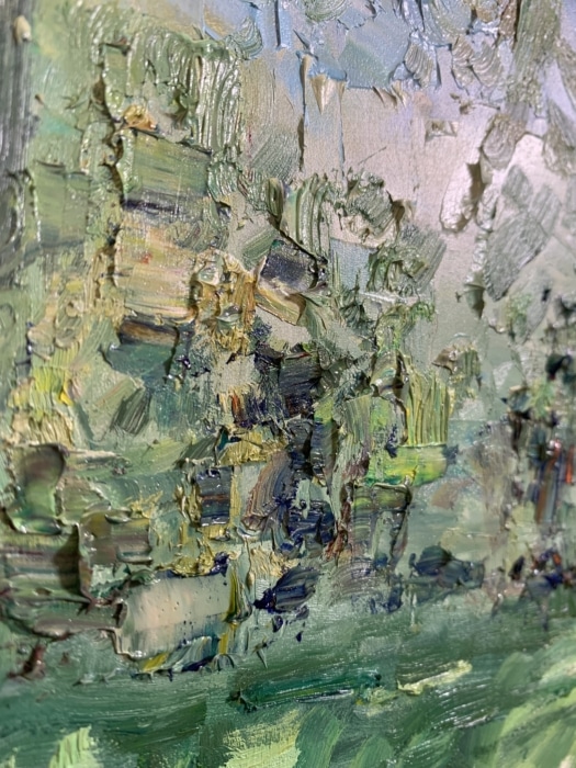
Dry brush over thick, textured paint: By the later stages of the painting, the paint on the surface was thick and almost dry. I loaded a brush with paint (no added solvent or medium) and, with a relaxed hand, dragged the brush over the thick texture. Paint would only hit the high points of the texture, creating all kinds of interesting marks and patterns. In the image below, see the white in the circled area. This was from one stroke.
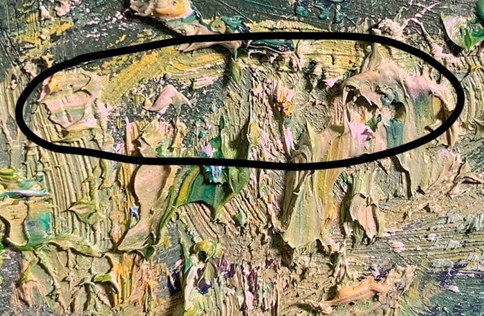
Palette knife strokes over dry brushwork: Similar to the above technique. With a loaded palette knife, I gently dragged the knife over the surface. The result is brasher than what you get with a brush.
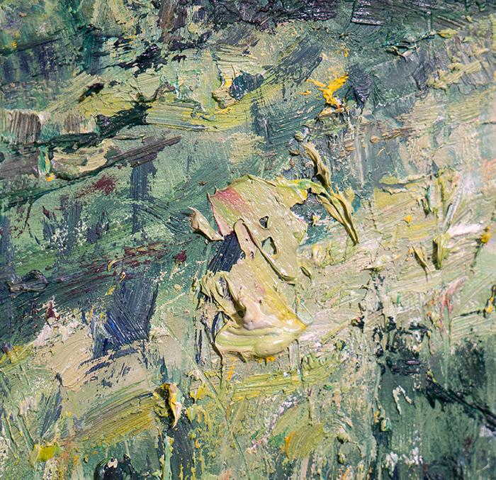
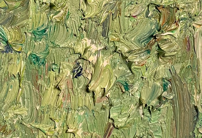
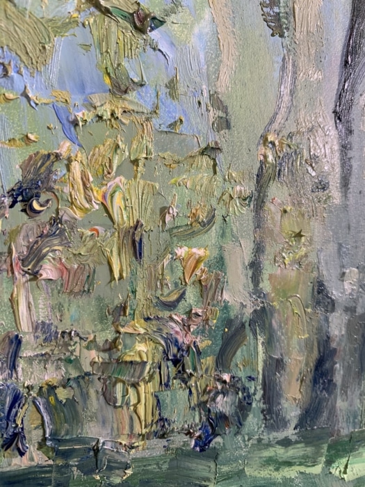
Dry, gummy paint: I stumbled across this technique as a result of my lazy cleanup processes. The paint on my palette dried overnight between sessions, leaving it in this thick, gummy consistency. This paint worked perfectly for thick, multicolored strokes that don't easily mix together.
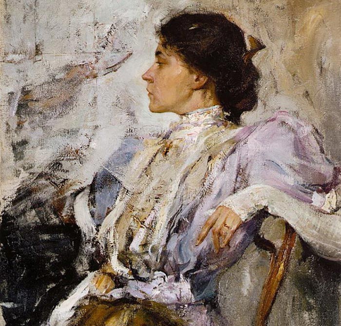
I read that Nicolai Fechin also enjoyed working with slightly dry, gummy paint. Here's an extract from artist Michael Johnson's website:
"Fechin didn’t have access to Claybord, but he made his own absorbent ground out of casein. The casein absorbed enough oil so that the paint “set up” quickly, allowing succeeding strokes to have a dry-brush appearance. Also, in the process of preparing his palette, Fechin would squeeze paint out on newspaper first. The paper absorbed a lot of the oil."
In the photo below, you can see where I have built up layer upon layer of this thick, gummy paint and how the colors remain distinct and unmixed.
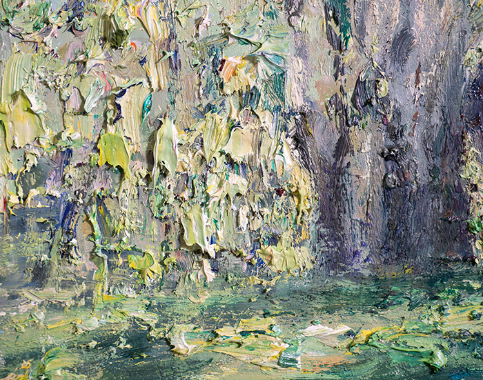
Tip: There is no single or best way to do things. Sometimes, even bad practices can make for good painting techniques.
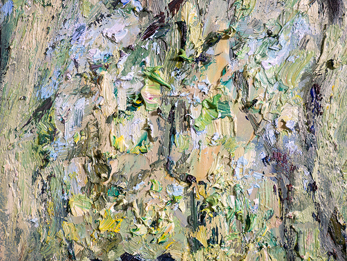
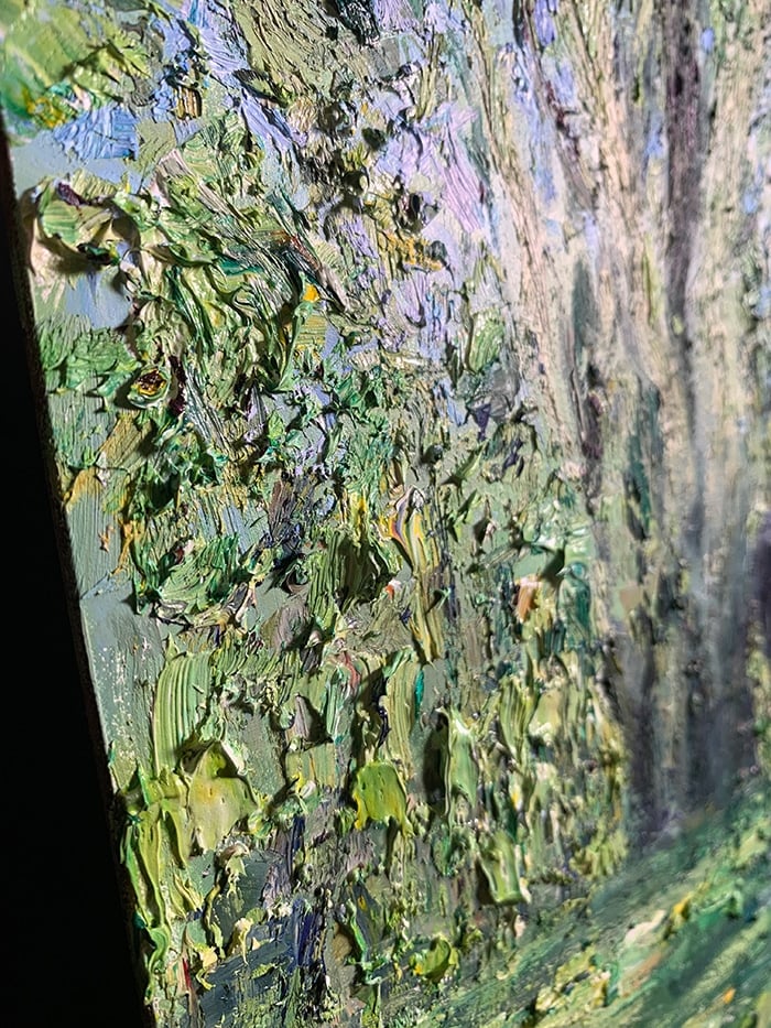
Flick the brush up: I placed a loaded brush on the surface and flicked it upward to suggest long strands of grass and stray branches. This is particularly effective when pushing the lights up into the darks or the darks up into the lights.
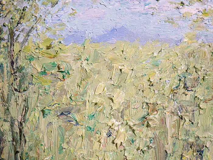
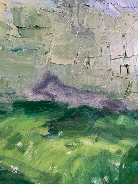
Multicolored strokes with brush or palette knife: I picked up several colors with my brush or palette knife and left them partially unmixed. I then made a clean, decisive stroke on the surface. Flat or filbert brushes work best for this. A single multicolored stroke will look like the result of many. You can see these multicolored strokes around the light middle ground, just below the distant mountain. Notice the subtle color variance within a compressed value range (the hue changes but not the value).
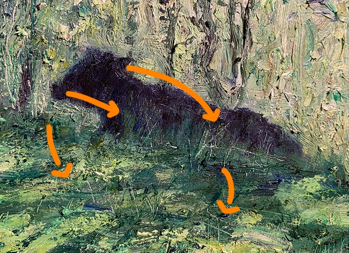
Scraping and scratching: You can use the blunt end of your brush, the tip of your palette knife, or even your fingernail for this. I used this technique to suggest strands of grass and intricate tree branches.
Below are some artists who weave together a vast range of techniques in beautiful harmony. Look at their work and see if there are any techniques you can adopt.
- Berthe Morisot
- Frederick McCubbin
- Frederick Cuming
- Jeff Watts
- Jeremy Mann
- Joseph Turner
- Konstantin Korovin
- Margaret Olley (this month's featured artist)
- Nicolai Fechin
- Richard Schmid
In my art classes back in school, I remember there being a focus on art history. But I found it to be painfully boring. I wanted to paint and draw and create, not read books and write essays.
I think what was missing was a practical element. We were learning history for the sake of it. The only end goal was to be able to write an essay and get a passing grade. Most students, including myself, did the bare minimum to scrape through. I would have been much more engaged had there been a connection back to the practical side of art. How can we use art history to make us better artists? That’s the point after all, isn’t it?
Art history is far more interesting when viewed in a practical light like this. Next time you visit an art museum or explore a new master artist, do so in a practical light. Ask yourself what you can adopt to improve your own work and to make you a better and more fulfilled artist. Be curious and ask questions. Try to put yourself in the artist’s shoes.
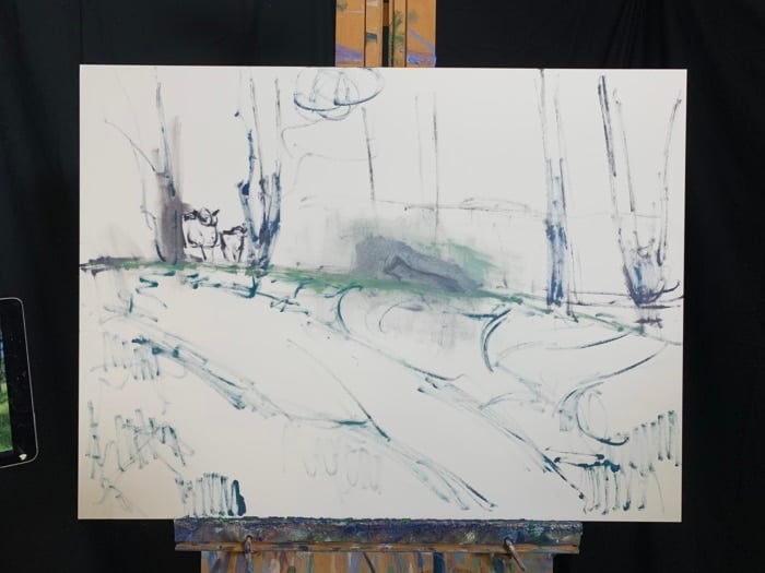
Here's a behind-the-scenes look at the creation of Maryvale, Cows:
Thanks for Reading!
I appreciate you taking the time to read this report. If you ever need anything, let us know at admin@drawpaintacademy.com.
Happy painting!

Dan Scott


Amazed by your thick paint methods. I’ve not learned how to do that except using much less than you do. Something for me to practice on Arches oil paper I think!